When you design artwork using Photoshop Element, please follow 2 rules:
1. The Rule of Thirds: A Photography Tip for Designers
One of the guidelines for evaluating the composition of a photograph is known as the Rule of Thirds. Simply put, this “rule” proposes that you divide a photograph into nine equal parts by drawing (or imagining) two vertical lines and two horizontal lines equally spaced over the image. Think of a tic-tac-toe board or the Brady Bunch family’s layout in the show’s opening credits.
The theory is that you place points of interest in the intersections or along the lines that your image becomes more balanced and will enable a viewer of the image to interact with it more naturally. It also keeps the subject away from the very edges of the frame.
The Rule of Thirds suggests that important elements of a photograph should cross these grid lines or the intersections of these lines. This creates a more balanced photograph that allows the viewer to interact with it more organically. And studies have shown that most people’s eyes go to one of the intersection points naturally rather than the center of the shot. You’ll notice that most professional photographers apply this guideline when setting up their shot composition to create more compelling images with greater visual tension and energy.

First, understanding this rule of thumb will help you identify and evaluate impactful photos when you want to pull an image for your designs. As you begin using the Rule of Thirds more and more when choosing images, it will become an almost unconscious design choice. You’ll find that you’re drawn to photographs that have this balance, resulting in more arresting design images for your work.
Secondly, it can help you crop images in a way that maintains their impact. Most image software programs (like Photoshop) have a cropping tool that draws a tic-tac-toe grid over a photo when you crop. This will allow you to balance and deliver an eye-catching image.
For example, let’s look at this image of a wagon in a desert. This image, which is nearly symmetrical both horizontally and vertically, does not follow the rule of thirds.

How do you fix it:
You place the main subject where the lines intersect rather centered in the frame. For example, keeping the wagon at one of the intersection points of the Rule of Thirds grid helps the image still look well proportioned, even if you’re forced to crop it in a way the photographer didn’t intend.

2. Apple Elements of Art and Principles of Design to your artwork
The Principles of Design are the recipes of the art. They help organize the elements, to make the art look aesthetically "pleasing" or "good". You may not use all of them in the same piece of artwork. The Elements of Art are the " ingredients". You use them to make your artwork. You may not use all of them in the same piece of art.


Example of using Elements of art and Principles of Design


Visual unity is best described as harmony, which is a design principle in its own right. It can apply to colors, using styles that work well together, and in some cases, repeating styles to maintain visual consistency.
Proximity
The simplest method of making objects appear to belong together is to group them closely together. This allows us to see a pattern.
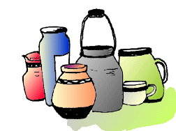
Repetition
Another method often used to promote unity is the use of repetition. Repetition of color, shape, texture or object can be used to tie work together.

Continuation
A much more subtle method of unifying a work involves the continuation of line, edge or direction from one area to another. Continuation is often used in books and magazines to tie the elements of a page together with the use of rules, and by lining up edges of copy, headlines and graphics.


